Tuesday, December 9, 2014

Catch & Shoot vs Pull Up and the risk of binning

Hi everyone,
a short note as I observed several articles making use of data binning. I am not saying that binning is automatically wrong, but it has at least one important potential flaw.

Let's use the catch & shoot vs pull up shooting percentage as an example. It is shown that catch and shoots are generally more open than pull ups. Furthermore, let us say that we define an uncontested shot as any shot where no defender is in a distance of 6 feet (that is binning).
Now, a study might find that uncontested catch and shoot attempts have a higher FG% than uncontested pull ups. But, if we now compare hypothetical distributions for both shot types
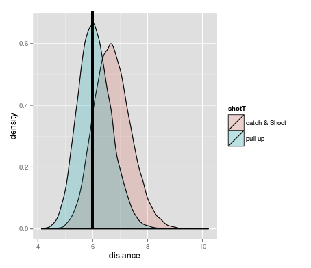
we can clearly see that the mean weight is not the same for catch & shoot and pull ups. 
Both for contested and uncontested shots, hypothetical pull up shots are clearly more contested.

That's it for right now. Don't say I didn't warn you.
Hannes

Update: I only mentioned the problem, but didn't offer any solution. I never had to work with a problem like this myself, but @neuteufel mentioned Propensity score. I guess there are probably a few more standard procedures, but the most important is that you are aware that open is not necessarily open (that sounds weird...)

Tuesday, December 2, 2014

Looking for soulmates (even though I don't believe in them...)

Hi everyone,

I was using hierarchical clustering quite a bit over the last month.
And two days ago I found this nice R-script, so I combined the data with my clustering.
Short info before it gets self-explanatory:
- Used all players that had at least 10 games and 12 minutes per game
- as the list is too long to show all the names, I will use subclusters where you can find the names
- tried to use minute normalized data (per 36)
- the effective field goal column is not used for clustering. I did not include any FG percentages in the end (for no real reason...)
- If a value is green, that means that there was a division by zero (mostly because the player never drove)
- If you have other interesting data, feel free to send it to me and I'll send you the figures back. Or if you have Matlab I can give you the code as well (probably should clean it beforehand...)

Without further ado (click on the figures to enlarge):

Monday, October 27, 2014

The 42 of the NBA lottery

Hello everybody,

I think I just found the perfect (albeit crazy) solution how we can fix several things that are wrong about the NBA: Let us support the mediocre teams instead of the incompetent!

Before I explain my idea, first the status quo:

  • The goal of every team is to win a title. Therefore, you need to get good players, small markets are the most likely to get good players at the draft. Therefore it is good to be bad.
  • The problem with one good player is, that he is usually not good enough to give you a title. Unless his name is LeBron or Tim Duncan, your typical number one pick does not necessarily lead to being a title contender. Therefore, you need to be bad for several years. Which is not easy if you just drafted a good player
  • Let's face it: A general number one pick cannot make you a title contender. It makes you at best an eighth seed, aka 'the place where you do not want to be'
  • For an eighth seed on the other hand, a number one pick could be exactly what the team needs to make it a title contender
  • Over the last years, I have heard several times that a team is dumb for trying to be a number 8 seed. Examples are the Bucks of the last years, or the Hawks every year. Or the Pacers this year. 'This is a lost year, the team should just give up!' and the likes
  • Last year I heard several times 'these scrappy Suns should deserve the number one pick for trying so hard!'
  • I think that every smart basketball organization can become mediocre in 3 years. Even if the team would play in the depth of hell or any other place in North Dakota (hell actually might give you a huge home court advantage)
  • Furthermore, the lottery system leads to 30% of teams waving the white flag after less than half of the season. Hell, 30% of teams probably even wave the white flag before the season
  • This does not happen in European leagues, du to relegation. The last teams are even the one that fight the hardest to win. I know, this is not possible in the US system that in general likes to have neither poor nor rich people - sorry, I'll stop my bad jokes now...

Wednesday, October 22, 2014

why you do not want to be stuck in the middle

Hi everybody,
just a quickie. Hope it speaks for itself.
Seth Partnow (I'm never sure if that's a spelling mistake), collected some data https://t.co/3hrprry8vR
It's pretty awesome, because it means that I can make interesting plots without an hour-long copy and paste job. Just ask if you feel like looking at a certain aspect of the data.
Back to Morey ball: Morey ball tells us that it makes sense to shot only from the rim or from behind the three point line if possible (sounds intuitive? Ask Byron Scott).
Short side note: I'll try to post something longer about this topic, as it is not as simple as it sounds to get open shots at the rim or from three point land (duh)
Interestingly, there is even a positive correlation for the Morey Ball shots (more shots from 3 or rim means higher effective field goal percentage from there) and a negative correlation for midrange shots (more shots from midrange means lower effective field goal percentage from there). Both with a small but existent correlation of around 0.4 (or -0.4).
Click on me
Cheers,
Hannes

Wednesday, October 8, 2014

Good cops - bad cops in the NBA

Hi everybody,

just a quicky as I stumbled over plus minus data. There are a lot of adjusted Plus Minus (PM) stats, but the idea is always similar: A players PM is obviously related to a teams point differential. So I took all players that had during the season a PM of more than 100 or less than -100 and plotted their PM per minute against the Team +/- per game. I leave the analysis to you.
Enjoy,
Hannes
All Cops

Thursday, October 2, 2014

Why shooting only one free throw would not increase the average value - but slightly change the game

Hi,

just a short one regarding an idea that was first mentioned here:
http://espn.go.com/blog/truehoop/post/_/id/70581/hoopidea-is-one-trip-to-the-free-throw-line-enough
The idea is to change the free throw concept to speed things up. Instead of two free throws that are worth two points, we could as well shoot one free throw worth one point. Or three points, if it's for a three-point foul and so on...
The always amazing Nylon Calculus crew spun it a little further
http://nyloncalculus.com/2014/10/02/shooting-one-free-throw-offense/
calculating that the expected points per free throw attempt would not change (so basically the mean), but the variance would increase (due to less attempts).
My first reaction was to say 'but what about offensive rebounds!? You cannot rebound the first shot!'
This is true, but it doesn't change the math (too bad, I love to be a nitpicker...)

FT% - Free throw percentage of a player
OR% - Offensive rebound percentage
POR - Points we expect after an offensive rebound
Expected points two free throw situation (resulting points multiplied with their probability):
1       *(1-FT%)*FT% +
1       *FT%*(1-FT%)*(1-OR%) +
2       *FT%*FT% +
(1+POR) *FT%*(1-FT%)*OR% +
POR     *(1-FT%)*(1-FT%)*OR%
0       *(1-FT%)*(1-FT%)*(1-OR%)
=2*FT%+OR%*POR-FT%*OR%*POR

Expected points one free throw situation (resulting points multiplied with their probability):
2       *FT% +
POR     *(1-FT%)*OR% +
0       *(1-FT%)*(1-OR%)
=2*FT%+OR%*POR-FT%*OR%*POR

So, even this doesn't change.
The aspect of the game that it would really influence is the 'it is late in the game and we lead by three points' situation.
Because the opponent would not be able to make the first shot and intentionally miss the second shot - as there would be no second shot...

Monday, July 14, 2014

(Part of) How the world cup was won

Hello World,
I haven't written anything in a while (there is this thing called thesis looming...). But today for some reason I do not feel like working (I feel more like drinking Krombacher or something like that). After seeing everybody on the German team running his ass off yesterday (either that or getting punched in the face), I wanted to show a plot related to this. It shows all field players that played in at least 5 games (so you needed to at least reach the quarter finals). The x-axis is minutes per game and the  y-axis kilometer per 90 minutes (as always, click on the image to enlarge).
 
As you can see, there is a clear negative correlation between minutes per game and average speed. But if you focus on those players that played more than 80 minutes per game, you can see that all of Germany's offensive players and full-backs are running a lot. And Boateng and Hummels are also running quite much for centre-backs. (Note: In German full-back and centre-back is simply outside and inside defender - makes way more sense in my opinion...)
Now, I do not want to imply that this is the best way to play. After all, the Finals were super close and Argentina could have won as well. And if your strategy is to defend deep and then try to strike quickly, your offense doesn't need to run that much (so, if you want to bash Messi or brazilian one syllable strikers do it somewhere else please).
BUT, I wanted to show that a big part of the German game style is to run as much as possible as a team.
So, thanks to Schweinsteiger, Müller, Lahm and everybody else for playing great football the last 10 years (Klose since 2002!). I appreciate that you are running your asses off.

Cheers,
Hannes

Saturday, May 10, 2014

Bridging the gap, Part III - Throwing the kitchen sink

Hi everyone,

for now, part III is going to be the final chapter of my Plus Minus / box score / tracking data comparison. Basically like 'Return of the Jedi', only with less Ewoks.
After looking at correlations between offensive and defensive Plus Minus and pairs of other data, I decided to look at general plus minus and everything at the same time. Using 17 different statistics, I am going to look at all possible combinations, to find the best ones for predicting the data. All possible combinations are in this case 217-1 = 131071 = a shit load of possibilities. I also decided to add a new type of players to my previous groups of Point Guards, Wings & Bigs, which I called 'Very Bigs'. It's basically only those bigs that are not attempting any three pointer. The idea is to get a more homogeneous group.

Monday, May 5, 2014

Bridging the gap, Part II - Defense

Hi everybody,

last time I bored you to death, I tried to find those stats that correlate well with winning a game on offense.
Today, I will take a look at defense and check what in general correlates best with winning a game (because to win a game, you have to usually play both defense and offense).
As all the groundwork got laid out in my last post, I will directly start with the goodies.

DEFENSE

Saturday, May 3, 2014

Plus Minus, Box Scores & SportsVU - a bit of bridging the gap (Part I)

Hello everybody!
I recently hit 1000 viewers which means - actually nothing (memo to myself: try to be first responder to as many Grantland posts as possible). Some weeks ago, after ESPN published Real Plus Minus (RPM), I dabbled a bit into comparing it to 'normal' box score stats - and I have to admit it was partly rubbish (but at least it looks cool!).
(Note: If you get bored during the next paragraphs, simply scroll down to the new fancy figures...)
The biggest critique points are in my opinion that RPM is a stat that already includes box score stats and that I used a model that only compared one stat with RPM at a time. The first problem is directly obvious: If I compare assists with a stat that indirectly concludes 'assists are super!', then I don't know nothing. The second problem is a little bit more tricky. Imagine that assists correlate with turnovers (which is actually true, so you do not have to try very hard). This influences the analysis, as turnovers are generally seen as negative and assists as positive (for some strange reasons), but both could correlate as positive.
So, I started to use multiple linear regression, which sounds more dangerous than it is. Linear regression is basically: you have beans lying on the floor. Put a stick on the floor so that the beans are on average as close to the stick as possible. In the case of two factors, your beans are floating in space and you have to put on your space suit and adjust a board in a way that the beans are as close to it as possible1. I decided to not go further than two dimensions for the moment. That's probably another post.

Friday, April 18, 2014

New brooms try to avoid sweeps - trades and play-off implications

The regular season is over folks! Those 82 games rushed by like Goran Dragic on a fast break. And as the Play-Offs will start tomorrow, I will try to use those 82 games to shine a spotlight onto those players that changed their team during the season. Especially with regard to Play-Off implications.
Looking only at players that played at least 12 games for both of their teams and at least 12 minutes per game, I had 23 players that fulfilled this criteria. Of those 23 players, the trade of 22 somehow were at some point involved with Play-Off teams - and number 23 is Spencer Hawes. I stripped the following graphics off most of those players that are now playing for lottery teams (e.g. Jan Vesely). Off players whose season is ended by now, I only kept Rudy Gay, Spencer Hawes and Luol Deng - I thought their numbers may be interesting for the general fan. The numbers that players put up for their Play-Off bound team are in red. So, I hope you will enjoy the following figures and thoughts:

1. General playing and starting time of players

Friday, April 11, 2014

Quick one before steals get overrated

UPDATE: I just realized that parts of my criticism are already addressed here: http://fivethirtyeight.com/datalab/steals-are-predictive-but-are-they-that-important/ . In my opinion the metric that Benjamin Morris uses there is the way more important one (predictive value) - but the result would have destroyed the superlative that his main article produces. 'Steals are super predictive' is more interesting than 'Steals are a bit predictive, around as predictive as Rebounds or assists'. But back to my article...

I read the 'The hidden value of the NBA steal' article yesterday and read the same day something about '...Can you really retire as the all-time leader in a statistical category (which is now gaining more favor among stat-heads)...', where they spoke about steals. I am not 100 percent sure what precisely Benjamin Morris did in his analysis, but let me quickly summarize some things that can be fishy about it.

Thursday, April 10, 2014

The non-ultimative Plus Minus comparison

Hi,
for all two of you that haven't enough of it yet:
There is a great article on different types of adjusted Plus Minus over at Hickory High (great name by the way :) ). This allows me to keep my number of words to a minimum (I can hear your relieve...).
Instead I'll just quickly show some comparing plots between ESPN's Real Plus Minus (RPM on the x-axis) and GotBuckets @talkingpractice (more great names) regularized adjusted Plus Minus (RAPM on the y-axis).
My takes on it: Even though they are similar (as expected, because they are based on the same measurement), we can still see that they have some spread. This tells us that you should never start arguing that player A is better than player B if there PM differs by less than three points (more or less). Also, RPM generally gives a higher impact to single players. Feel free to get really angry at one or both of the two stats because they got something completely wrong ('How is Marc Gasol so bad in offensive Plus Minus!? This doesn't make any sense!'). I'll now show in the following order:
1. correlation between RPM and RAPM for all 425 players I had available.
2. RPM vs RAPM for players that played more than 41 games and 28 minutes per game
3. the same for the offense
4. the same for the defense

(as always, click on the figures for larger versions. I guess that here it's really necessary)

Defensive Real Plus Minus and it's relation to 'normal' Player Stats

Hello everybody,

(Note: for those of you that don't like words, it gets more interesting at the bottom of the article)
I made a few more comparisons between real Plus Minus and more common stats. More common stats are in this regard stats that you can measure for individual players on a night to night basis (either advance by tracking or the typical things, like points, assists and steals).
My question today is: How do common stats in general influence the outcome of a game on the defensive end? (Offensive end should be following soon). For example, if you look at one single event like a block, you would say that it certainly gives you a positive result (see Plumlee, Mason). But often, going for the block (especially as a help defender) opens rebound opportunities, so that blocks are not necessarily a good thing. So, I tried to search for correlations between those single event stats and the outcome oriented Defensive Real Plus Minus (DRPM). I looked at Centers and Point Guards separately, to get a good spectrum of the possible influences. All players I used played at least 41 games and 15 minutes per game. The interesting value is the correlation coefficient. As rule of thumb, you can discard any correlation with an absolute value below 0.2, while everything with an absolute value above 0.4 makes it very likely that this stat is generally influencing the outcome of a game on the defensive end. Please be aware that correlation does not imply causality. As an example: Turnover Percentage for center has a positive correlation of 0.24 with DRPM - but we would all agree that it's probably not a good idea to loose the ball more often (even though that would explain why Scotty Brooks still plays Kendrick Perkins so much).
If you are interested in other stats let me know.
Phew, those were a lot of words for the Generation ADHD ;)

Tuesday, April 8, 2014

Are you #TeamPER or are you #TeamRPM ? (or do you hate acronyms?)

Hi everybody,
just a quick one, since ESPN published a new kind of adjusted Plus-Minus yesterday (called real Plus Minus, RPM). I don't want to go too far into the merits of either stat. I am pretty sure that RPM has problems like every adjusted PM before and PER is basically just 'boiling down more common stats to one number', but it were the two things I just had at hand. If somebody gives me a table that has both RPM and another adjusted plus minus, I'll gladly repeat the following, which is doing a simple linear regression. I know the word sounds dangerous, but linear regression is basically complicated for ' draw a line through your data and check how far stuff is away from this line'.  Using 293 players that played at least 48 games, the correlation between RPM and PER is 0.52, which can be described as 'existing, but not very high'.


Monday, April 7, 2014

The arbitrary award Part II

... aaaaaaaaaaaand we are back! If you for some reason missed out on part one, it's here (that's also the part where I have the better jokes).
To summarize, yesterday brought us several tiers of iMIP (imho MIP) candidates based on Player Efficiency Rating (PER) data. The tiers are:
'Very good third year growth curve' (Alec Burks, Brandon Knight, Marcus Morris), 'Extremely good third year growth curve' (Markieff Morris), 'Pops principles' (Patty Mills, Marco Belinelli), 'Starters becoming All-Stars' (DeMar DeRozan, Goran Dragic, Isiah Thomas, Paul George), 'All-Stars becoming Superstars' (Anthony Davis, DeMarcus Cousins - and yes, I am aware that Cousins isn't an All-Star on paper...) and 'the reason why PER is not perfect' (Brandan Wright, who shows that your PER goes through the roof when you live one foot away from the basket).
Somehow I forgot to mention 'the guy that came from the D-League' James Johnson, who has one of the best highlights of the year.
I will now underline some of the stats that are related to PER to show you how these players improved.
You can click on the images to get larger ones. I sometimes move the names a tiny bit for readability.
For each pair of images, you will find in the left panel the 2013 statistics and how they changed in 2014. in the right panel, you will see how this data in general correlates to PER. It will start with those stats with a high correlation (or in case of turnovers a high negative correlation) with PER and then we will move our way down. Sounds complicated? You'll see it's not.

Sunday, April 6, 2014

The arbitrary award - a statistical look at the MIP candidates (Part I)

Of all the NBA season awards, voting the most improved player seems to be the worst defined one. The reason therefore is that improvement can happen on so many levels (for those of you that are interested in a good read about the different ways to look at it, check out this article by Rob Mahoney). It is also complicated to keep your eye on the complete picture, as you have to look at two or more years at the same time.
To give at least a data-based picture of potential candidates, I will use the data from Basketball-Reference. The focus will be on minutes independent data, as in my opinion improvement has to be more than just an increase in minutes played. Today, I will present the candidates and in part II (hopefully tomorrow) I will take a closer look at what they improved. Feel free to let me know where you agree or disagree (my dear hypothetical reader)

Filtering for candidates
To be a potential iMIP (imho MIP) candidate, players have to fulfill the following minutes/games criteria:
- Play at least 8 minutes per game in at least 41 games in 2012-13 (henceforth called 2013)
- Play at least 18 minutes per game in at least 41 games in 2013-14 (henceforth called 2014)
This means (more or less) that the player was last year at least a borderline rotation guy and is this season at least a 7th man (second player coming from the bench) and not only playing in garbage time.
Furthermore, I use Player efficiency rating (PER) to summarize the qualities of a player. There are certainly disadvantages to PER, but its advantage is that it is pace and playing time adjusted. The thresholds for a player to be available are:
- increased his PER in 2014 at least by 3
- has a PER in 2014 that is at least 15
I am aware that 3 is an arbitrary threshold, but I picked it on the impression that enough players surpassed it. A PER above 15 on the other hand means simply that your performance in 2014 is 'measured' as above average. It's a feel-good story if you improved from being a bench warmer to rotation guy, but it's not necessarily iMIP material. This gives us the following picture:
click image to enlarge

Thursday, March 27, 2014

Just putting it out there - random thoughts on the Sports Analytics Innovation Summit in London

  • It's great to see so many people working on so many different sports related topics - youth development, from youth development over health related issues to on field and PR strategy
  • The 'driving on the left side' thing is going to kill me one day
  • I think I now know the 'Data Analytics pyramid' by heart. More or less Data -> Information -> Knowledge -> Wisdom. Was probably the most repeated phrase of the weekend. But is in my opinion not the most important general truth
  • In my opinion most important truth was brought to us by Bill Gerrard (imagine the Scottish version of Billy Beane ;) ): Big data can give you the correlation, but small data gives you conclusions
  • To put it in my own terms. I think that a lot of people think that big data gives us the answers. At least in sports, big data is much better suited to lead you to more specific questions

Tuesday, March 25, 2014

Who needs to shoot if you can drive - a case for Tyreke Evans

Over the last five years, Tyreke Evans went from Rookie of the year to being a disappointment. Alongside Josh Smith, he is a punchline for people that shouldn't shoot.
And his shot chart still is red as a baboon butt.
But by in-depth video analysis (I saw two quarters of a Pelicans game recently) and thanks to the nba.com/stats data, I saw some weeks ago that there is some value to Tyreke. So, after he got #StatLineOfTheNight honors and praise by Zach Lowe, I decided to be an opportunist and post this figure:
(Click to enlarge)
Tyreke drives the most (per minute) off all players & his team scores quite well on those drives

Thursday, March 20, 2014

Three quick points on Kyle Korver and the Splash Brothers

As Korver could finish the season with the best Effective Field Goal Percentage ever and Steph Curry and Clay Thompson are destroying every 3 point duo statistic there is, some 3 point bullets on them:

Player Filter: >40 games, >24 minutes, 5 3 Point attempts per game
  • You know what, I think the graph speaks for itself (click on it for a bigger version)
Have a nice day everybody,
Hannes

Tuesday, March 18, 2014

Data dumps - the problem with low hanging fruits in sports story telling

Disclaimer: The reason I picked recent articles by Kirk Goldsberry and John Schumann for this post is not because they are doing a bad job. The reason is that I like reading their work and thus their articles catch my attention easily. Even my last post ignores some of the things that I'm about to criticize. But, as every up and coming rapper would tell you - the best way to make it in the business is by writing a diss track about the big fishes. ;) (Note: I hope I'll not end up as the Benzino to Kirk's Eminem)
So, here we go:

A tale of two players
Imagine two players taking shots from the right corner of a basketball court. Both of them previously shot 8 of 20 (40%) from beyond the arc at that spot. Now, player A makes the next 5 shots, which raises his shooting percentage to 52%. Player B misses his next 5 shots, which drops his percentage to 33%.
Question 1: How sure are you that player A is a better three point shooter from the right corner than player B.
The scientific answer: There is only an 85% probability that A truly shoots better than B, or in vague terms 'it could be true, but you would not be able to publish it as a scientific result'.
Question 2: How sure are you, if I tell you that player A is Stephen Curry from last season and player B is Stephen Curry from this season? (Note: Up to now, Curry took 22 shots from that position)
So, it is more than a bit misleading, if Kirk uses the term 'Kryptonite' to describe his 33% shooting from that position. This leads to comments by readers like 'Any theories on why he's so much worse from the right corner 3?', followed by others that try to find a reason. The true reason is most likely random noise in making or missing a shot.1

Thursday, March 13, 2014

The 8th man starters - Part I

Nate Who!?
Nate Wolters (22.3 minutes per game). This is my personal answer to the fun game 'go to stats.nba.com sort players by minutes per game and name the first one for whom you have no clue which position he plays' (Fun is a loose term here, but it could be a nice game between basketball nerds. Just like limbo it's about who gets the lowest). Well, being a Buck probably doesn't help with getting recognition.
But it is a nice start to my question: 'If you had to pick five 8th men to form a team - who would you pick?' or to put it differently 'Which five players could start for the 76ers?'. To find something like an answer, I will use data from nba.com/stats and basketball-reference.com collected on 7th of March 2014. To be 8th man eligible, a player had to play 12 to 24 minutes and in at least 30 games. I will mostly use percentages or Per36 values and will give data of Starters (at least 30 minutes per game) as benchmarks.
To make my life easier and because positions are becoming more and more vague in any case, I will pick my team as one Point Guard, two Wings and two Bigs. There are two great stats on nba.com that - normalized by minutes - can be directly used as a filter to automatically divide my players into those three groups: One being time of ball possession and the other defended opponent field goal attempts at the rim. Plotting those two stats against each other we can easily see how we have to set the threshold for each group. By overlapping those thresholds a bit, we assure that we don't miss out on anybody.
(click to enlarge)

Tuesday, February 25, 2014

SportsTribution - Gooooood day sweet world!

Hello everybody (all 13 people that probably find this blog),
as this is my first blog entry, some things about me. My name is Hannes (short for Johannes) and I'm German (which will explain my grammar and love for long sentences). I previously studied math in Germany and am now doing a PhD in bioinformatics (this part explains my interest in data). I also play very unprofessional basketball and try to actively follow the NBA (as actively as it is possible for not being able to watch the games live due to things like time zones).

I recently started to dive head first into the data on http://stats.nba.com and started a small program that I called SportsTribution1. SportsTribution allows to look at two information of data at the same time and you will see more about it very soon. I am sure that some people will find it crowded, but I promise that the four readers that are still reading right now will quickly get used to it.
It is available for free (right now only upon request, but I promise to quickly change this) and I am happy for any kind of critic (other than 'your stuff sucks!' of course...). Also feel free to publish content created by it.

SportsTribution is a great way to see outliers that are usually hidden, because they concern more than one type of data at the same time. My favorite example (up to now) is a plot called 'Josh McRoberts treats the ball like it's a hot potato!'
Comparing minutes of ball possession with the number of passes. Both values are normalized so that every player would play 36 minutes per game. Players are filtered by games (at least 40) and minutes per game (at least 30). Data published on nba.com on the 24/02/2014